Why is Sergi Delgado an influential typographer?
Sergi Delgado is a graphic designer based in Barcelona. Many of his designs include type for various purposes, including posters, covers, and some animated pieces. His style is quite unique, reimagining geometric shapes in new ways that add feeling. A lot of his creations make use of either black & white stripes or bright, bold colours brought together in order to catch people's attention. Each piece typically has about 1 to 3 words, or sometimes single symbols, which gives plenty of room to explore their shape and legibility in new ways. Despite being based in Barcelona, a majority of his works are in English, and he even has a Chinese piece for Fortune China.
Some of his work is for particular clients in Barcelona, some has an important message he wants to share, but some is merely a fun experiment with how he can manipulate shapes, colours, and text. All along city streets his works advertise events and cover magazines seen by people everyday. In his more experimental work, he morphs writing to such degrees that it becomes like an optical illusion just to read. He loves playing with stripes and other textures to hide text in plain sight, or to give still words movement. He also has animated pieces that play with revealing hidden text.
What is the most significant contribution Delgado made to the field of typography?
Delgado has had plenty of important contributions to the Barcelona streets. His artwork can be seen displayed all across the city in all different forms. Plenty of advertisements use his work to get their message across. The biggest impact he has had is likely the studio he is the director of. Back in December of 2019, he became the founder of a small business called Diatomic Studio, a collaborative studio that, although being multidisciplinary, focuses on graphic design and type experimentation. The artists have a combination of artistic backgrounds of an assortment and they come together to make something truly special in their works. Diatomic is a small studio, with only 4 designers employed, but each one loves to do collaborative work across Barcelona.
As AI becomes more and more prevalent in the design world, Diatomic's mission is to design creative layouts and mockups that bring humanity back into design. The designers, such as Delgado himself, find dynamic, eye-catching ways to play with geometric shapes inspired by psychedelic and surrealist artists. Even the static designs convey movement in a way that can't be captured by a machine. Every artist puts heart and soul into various creations that give the world life and colour.
What has Diatomic Studio inspired/influenced in the field of typography?
Much of Diatomic's work clearly has the voice of Delgado and his use of shape and colour, but scrolling through their works, other illustrations and graphic designs have the chance to exist and be seen by the public. Across Barcelona there is a wide variety of typographic styles and graphic design for all kinds of businesses and events. Many of these have been designed by someone in Diatomic Studio, but others have very similar influences with bold, geometric text and bright colours. Whether it's Delgado taking influence from the world around him or if others take influence from him is not clear, but likely it's a back & forth between each artist in Barcelona.
The studio is still quite small, but they do help other small artists all around them. Diatomic's anti-AI stance has led to the creation of mockups for other designers to use in any of their works. They made anothermockup.com in order to sell these mockups to other designers all over. Anyone can buy these mockups based on different locations around Barcelona and use them however they please. Promoting their style and giving tools to other artists helps bring life back into the art community. They have made their impact on the art scene.
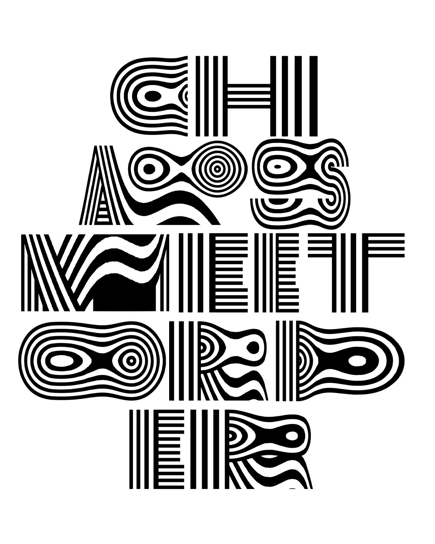
A typeface designed by Sergi Delgado
In Delgado's typographic explorations such as his works Chaos Meet Order and Freedom From Chaos, he uses multiline typography as a base to play with letter deformation. Many of his works have similar elements, but the execution makes this series special. No other pieces can so heavily distort the text while still being easily read. There is no consistency in lineweight but it makes it work all the more.
In this experimental study, he begins with a bold, geometric display typeface made of thin black & white stripes. Then, each letter is stretched and warped to add a psychedelic, near optical illusion style visual. Letters with curves get bent and squished into new shapes, making ripples in the stripes. Even straight letters, like A and M, are given some waves.
Every individual letter in the piece has an original design with its own personality and style. Duplicate letters are made unique by stretching them to different widths and alternating the black & white stripes. The way the A and O fit together in the word “chaos” goes against the rest of the pattern of the text, which aids in conveying the message beyond the words themselves. They sit nested in each other without taking away from the readability of the text.
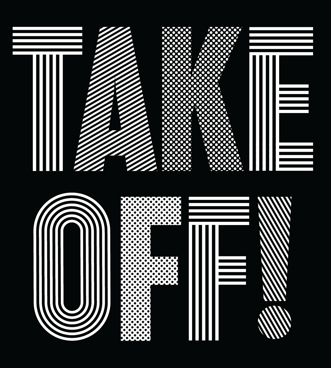
A typographic composition designed by Sergi Delgado
In a more recent piece, TAKE OFF! from Delgado, he makes two different versions of the same composition for Fiu Barcelona. He was commissioned to make these to cover each side of a tote bag back in 2019. Each one has a different energy and highlights different aspects of Delgado's style. Starting with a base reminiscent of fonts like Impact, he utilises different patterns to add flair and personality.
Firstly, the black & white variant of the design gives a different pattern to every character. The stripes and dots are different thicknesses so the overall colour at a distance is different for each letter, giving the bags a fun look from people standing farther away. It's a simple, clean design that contrasts and compliments the design on the other side of the bag.
On the colourful side, the text from the first design is distorted and given pops of red and blue. The colours and textures break into separate shards of text and background, as if it is broken by some kind of takeoff. The layout is dramatic, contemporary, fun, but still looks professional; it has a balance to it that just goes to show the amount of skill that goes into his pieces.